Checkout · Liberty · 2026

The same purchase, before and after.

Liberty Club is a commission-free e‑commerce platform, with five payment methods in pesos and on blockchain.

The problem
The checkout worked, but it didn't always tell the truth.
What I did
I redesigned how it looks and how it flows.
The result
In production in 9 days.

Keep scrolling

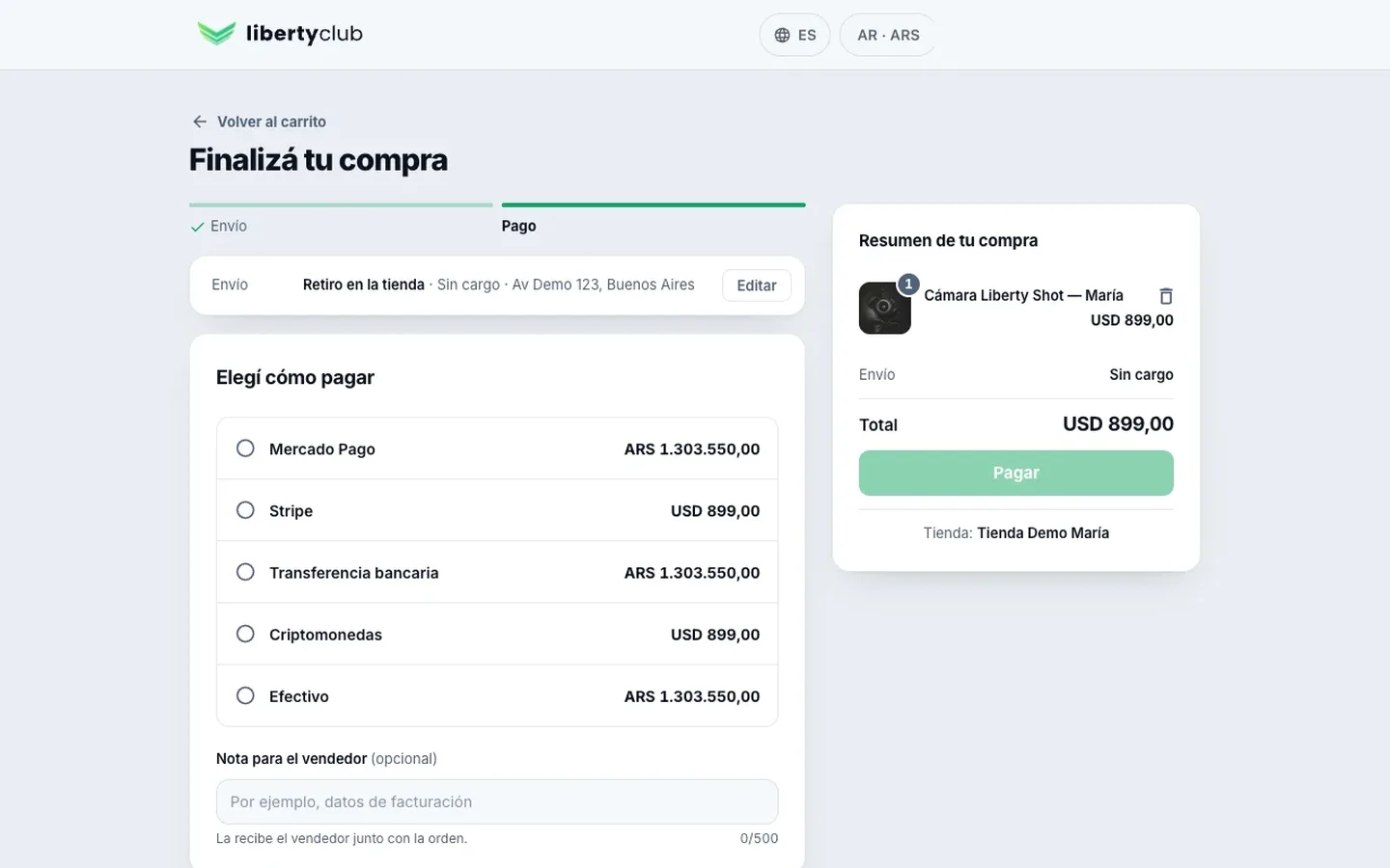
Liberty's redesigned checkout: the payment step, with the five payment methods
  • RoleUX Lead
  • TimelineSeptember 23 to October 1, 2026
The problem

The checkout worked, but it didn't always tell the truth.

What I did

I redesigned how it looks and how it flows.

And I led its AI-assisted build. Payments, shipping and guest checkout had already been built by a teammate.

The result

In production in 9 days.

Five parts, each delivered separately.

Tools: Claude, interactive HTML prototypes, Linear and GitHub.

Before and after

Before

After

Your details

These are test screenshots, with the same data on both sides.

Decision 1 of 4

Every completed step stays in view.

Before, what you'd entered disappeared and, to change it, you had to go back step by step. Now it stays at the top, with “Edit”.

Liberty checkout, the Payment step: at the top, the chosen shipping with the “Edit” button; below, the five payment methods with the amount for each

Decision 2 of 4

Shipping shows its real cost.

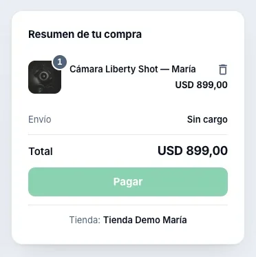
Before, it could say “ARS 0.00” even when shipping wasn't in the total. Now, “To be determined” until it's chosen, and “Free” only when it really costs nothing.
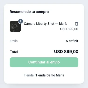
Liberty checkout: the order summary before choosing shipping, with the Shipping line “To be determined”
Shipping not chosen
Liberty checkout: the summary with in-store pickup, with the Shipping line “Free”
With in-store pickup

Decision 3 of 4

The final screen says what really happened.

Before, it said “Purchase Successful!” with any method, even with an unconfirmed transfer. Now, one title per situation, and “Purchase successful” only when the payment is approved.

Liberty checkout, before: a purchase by transfer that said “Purchase Successful!” before the seller confirmed the payment
Before
Liberty checkout, after: the same purchase by transfer, with “We received your receipt” and a waiting clock
After

Decision 4 of 4

On mobile, the button always within reach.

Before, the button sat at the end, below the products. Now it's in a sticky, full-width bar, with the collapsed summary that opens when you tap it.
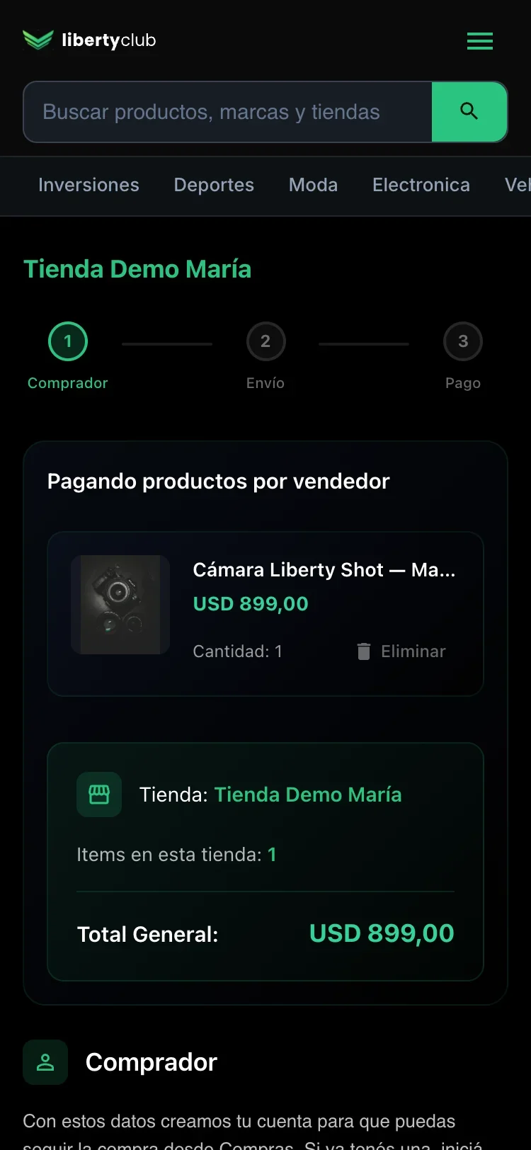
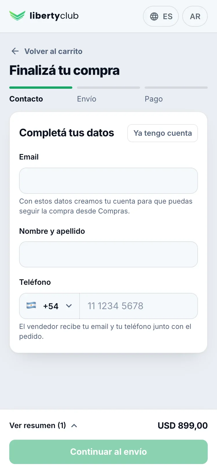
Liberty checkout on mobile, before: the site menu, the store, the products and only then the form
Before
Liberty checkout on mobile, after: the form at the top and a sticky bar at the bottom with “View summary”, the total and “Continue to shipping”
After

As a team

Five parts, following the team's rules.

Each one was reviewed separately and merged following the team's conventions for branches, titles and descriptions. When a teammate's code changed midway, I kept their changes and listed them in the PR.

When each part was built

  1. Plan. Visual redesign, in five parts.Sep 23
  2. Interactive prototype. Four rounds.Sep 27–29
  3. Layout. Its own bar, without the site menu.Sep 28
  4. Steps.Sep 29–30
  5. Summary. Just one, instead of two.Sep 30
  6. Loading. The page's outline from the very first moment.Sep 30
  7. Results.Sep 30
  8. In production. That night, five fixes.Oct 1

The production test

I went through it as a buyer and fixed five things.

It was the night it launched. All five depended on real data, which only existed in production.

  1. An autofilled phone number with a leading 0 lost its last digit.
  2. Signing in with a real Google account didn't return to the checkout.
  3. The phone number saved in the account wasn't used.
  4. The pickup address entered by the seller showed up twice.
  5. When signed out, the cart didn't show.

One small fix per problem, each with a test that failed before and passed after.