
Liberty Club · commission-free e‑commerce · 2026

I led the redesign of the seller dashboard.

18 screens in 10 days, built with Cursor and Claude Code.

Keep scrolling

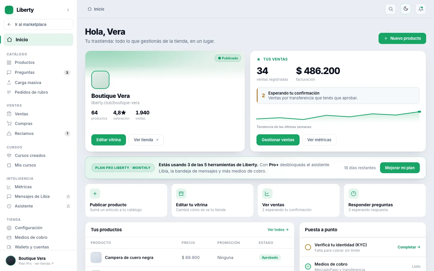
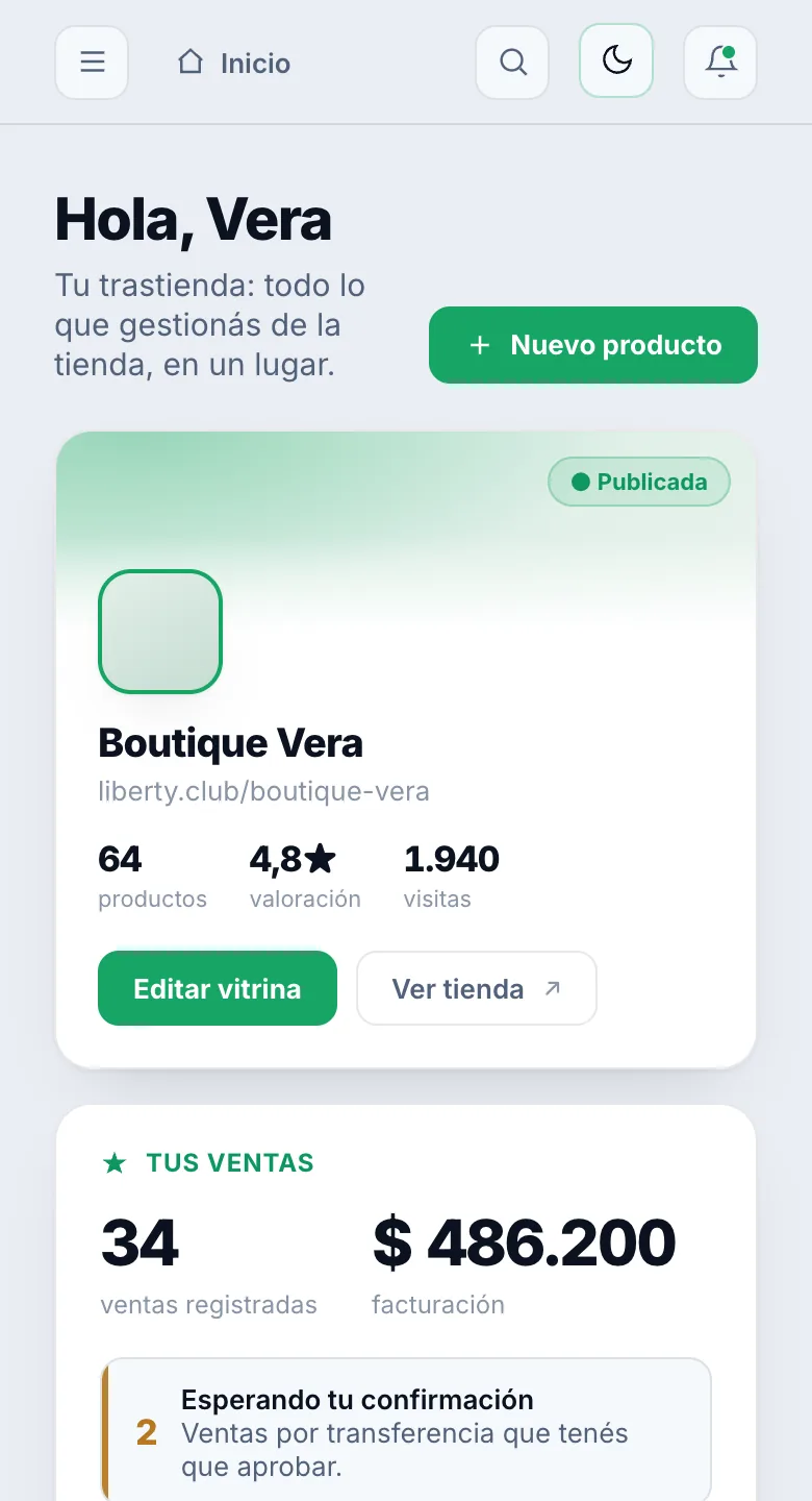
The prototype of Liberty's seller dashboard Home screen, with sample data: the “Boutique Vera” store, its sales, the plan, the shortcuts and the products
Before
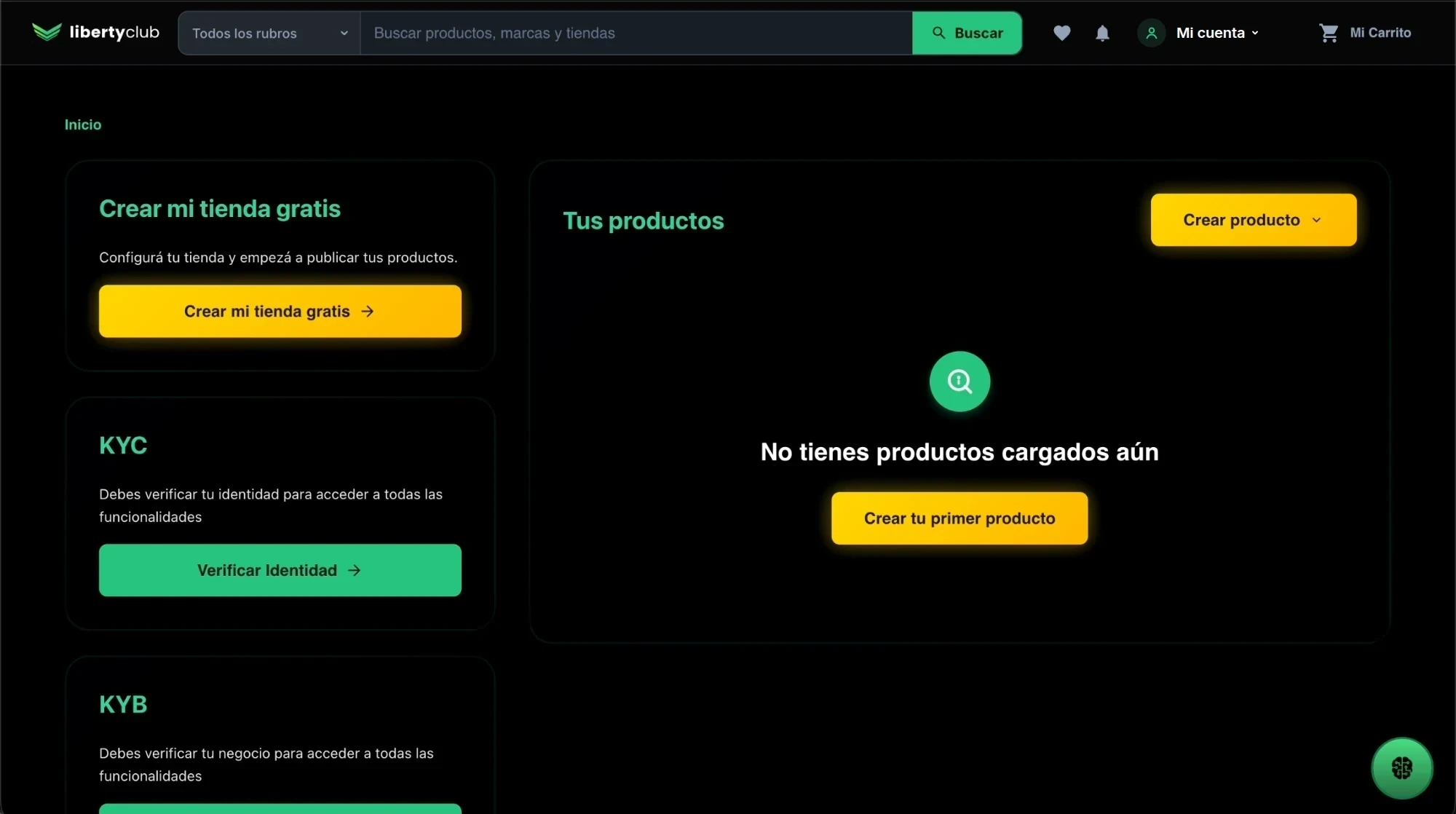
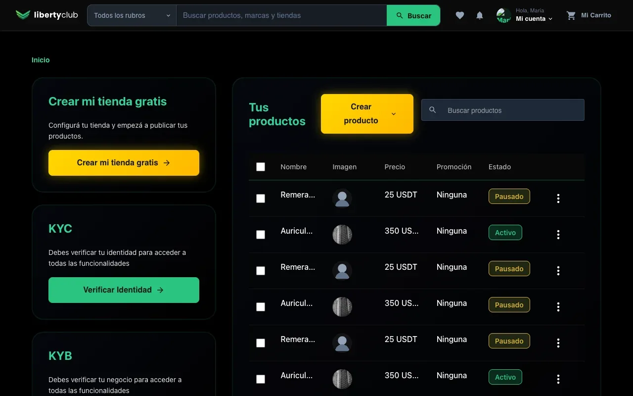
Liberty's previous seller dashboard: the Home screen inside the site, with the search bar, “My account” and the cart at the top, and cards to create the store, verify identity and upload the first product

Everything hung off the buyer's “My account” menu.

Before
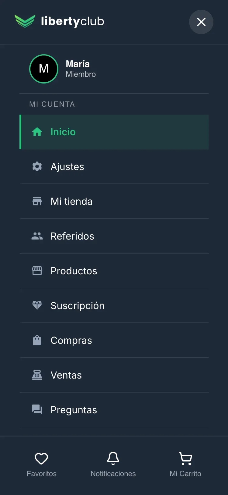
Liberty's previous seller dashboard on mobile: the site menu, with “My account” and the seller options mixed in with Favorites, Notifications and Cart

Everything hung off the buyer's “My account” menu.

After · Everything in one dashboard

18 screens
in six groups,
with their own navigation.

  • AILibia messages · Assistant
  • AjustesConfiguración
  • KYC/KYBVerification
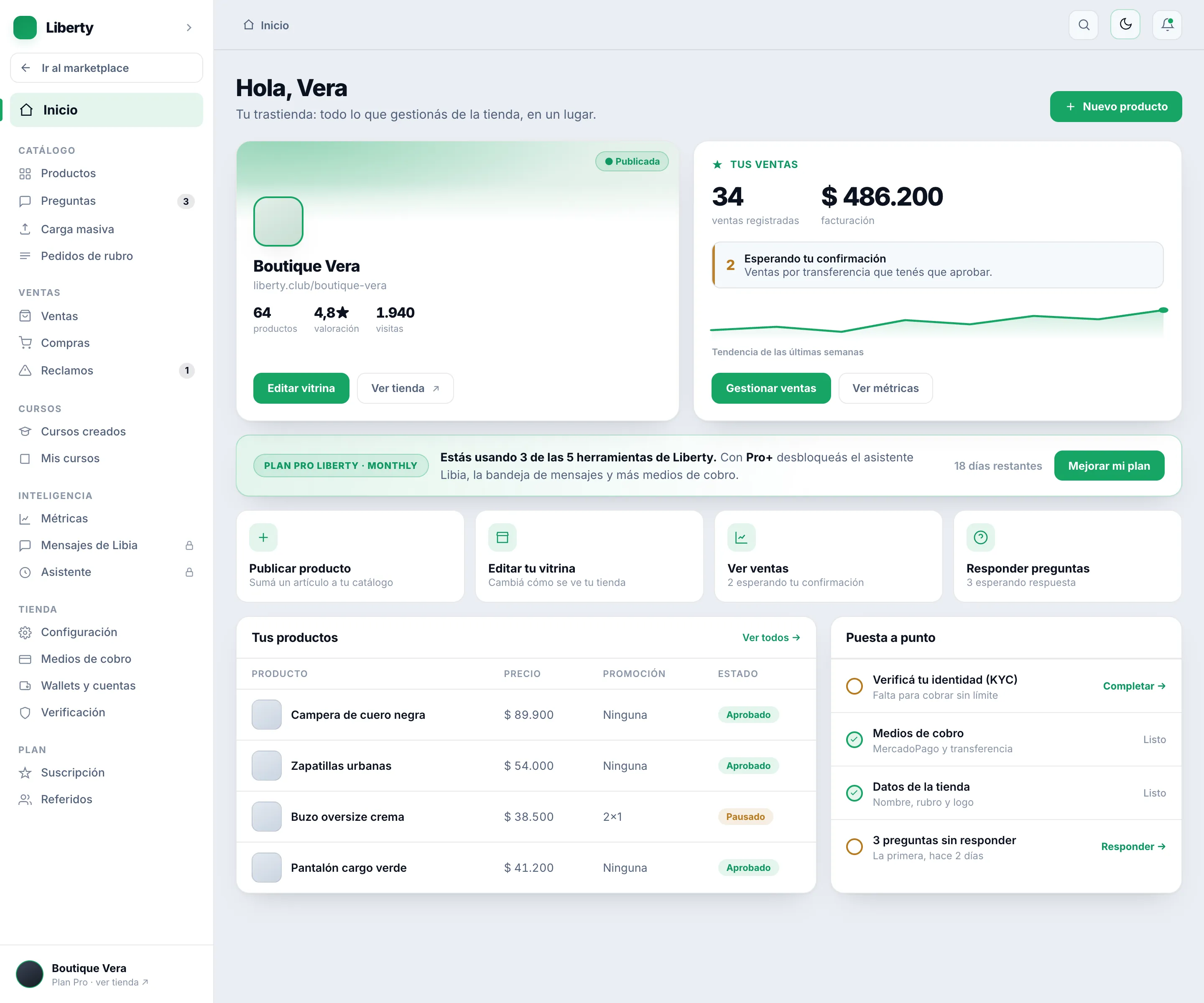
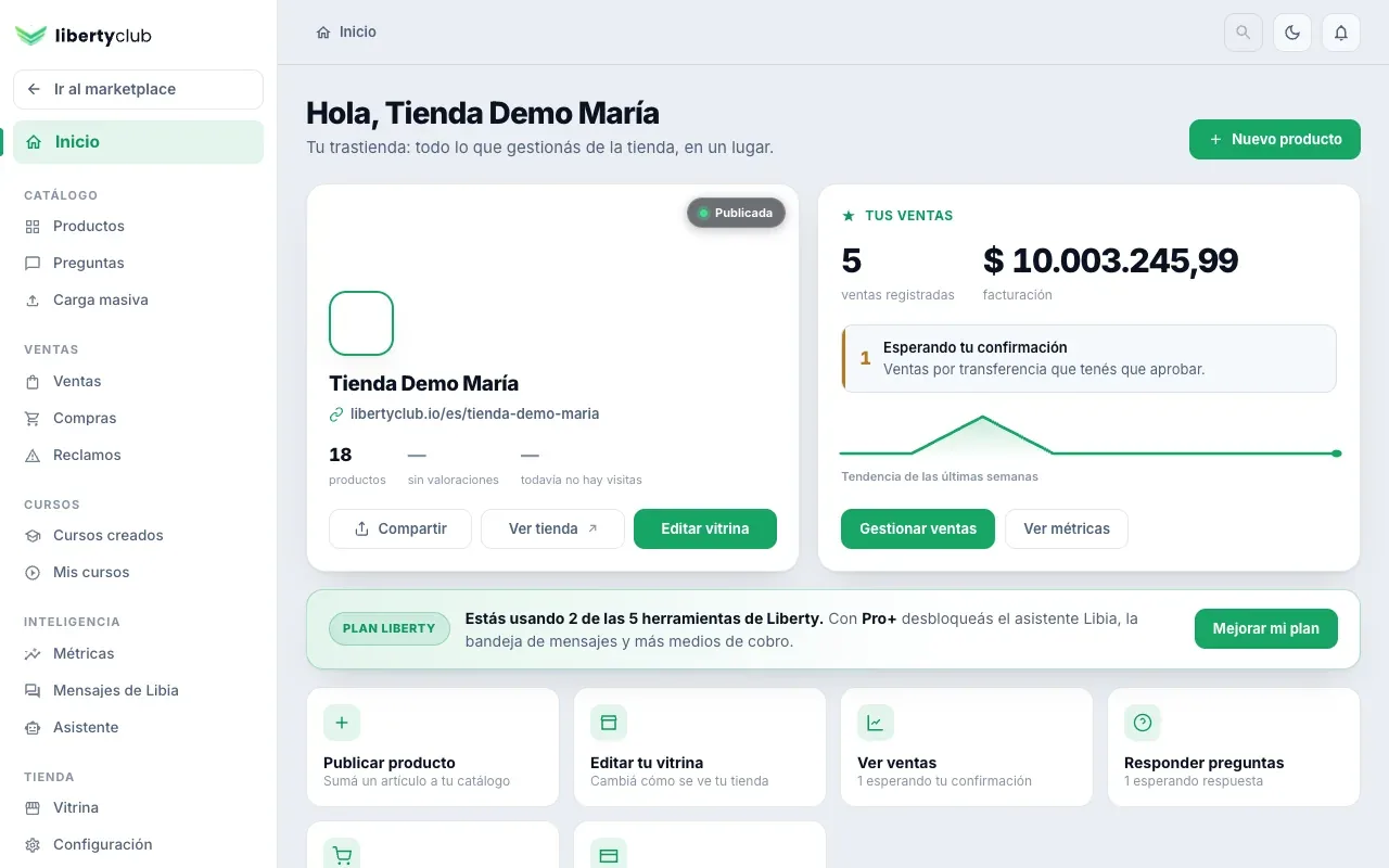
Liberty's new seller dashboard: the Home prototype, with sample data, the store card, sales, the plan, shortcuts and the product list

Sidebar groups: Catalog, Sales, Courses, Intelligence, Store and Plan.

Liberty's new seller dashboard on mobile: the Home prototype, with the “New product” button and the store card

Sidebar groups: Catalog, Sales, Courses, Intelligence, Store and Plan.

My method, with AI agents at every step.

  • RoleUX Lead
  • TimelineAugust 21 to 31, 2026
The problem

There was no clean, centralized navigation.

Each section reloaded the whole screen, with a 3-second wait, and store management was mixed in with the buyer account.

What I did

I led the design and the implementation.

I defined the design system, prototyped in HTML to refine the navigation and the interface, and built the frontend with AI agents.

The result

In production since August 31.

Sellers manage their store and their products from one place, and every section opens instantly.

Five screens

The same account, before and after.

Before

After

Decision 1 of 4

Structure first, then the screens.

I separated the dashboard from the shopping site and gave it its own side menu. That way, I could see each screen working before redesigning it.

Dashboard prototype on mobile
On mobile: the HTML prototype I used to validate the design, instead of a Figma one. It's the same one, and you can try it here. It's in Spanish, like the product.

Decision 2 of 4

Every state tells the truth.

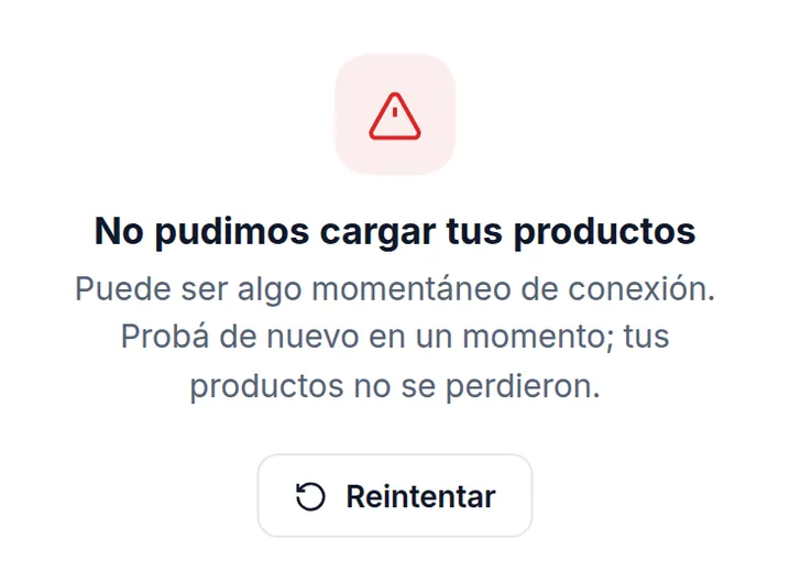
Several screens treated a network error as an empty list. Now each one tells apart loading, empty with its action, and error with “Retry”.

Liberty seller dashboard, before: with the network down, Sales showed the empty message “You haven't sold anything yet”
Before · with the network down
Liberty seller dashboard, now: the Products table with an error, “We couldn't load your products” and the Retry button
Now · prototype, with an error

Decision 3 of 4

Names you understand at first glance.

The menu spoke in acronyms and internal names. Now each option is named for what it is, in clear, friendly language.

  • KYC / KYBVerify your identity · your business
  • AILibia messages · AssistantLibia is Liberty's assistant
  • CourseMy courses

Decision 4 of 4

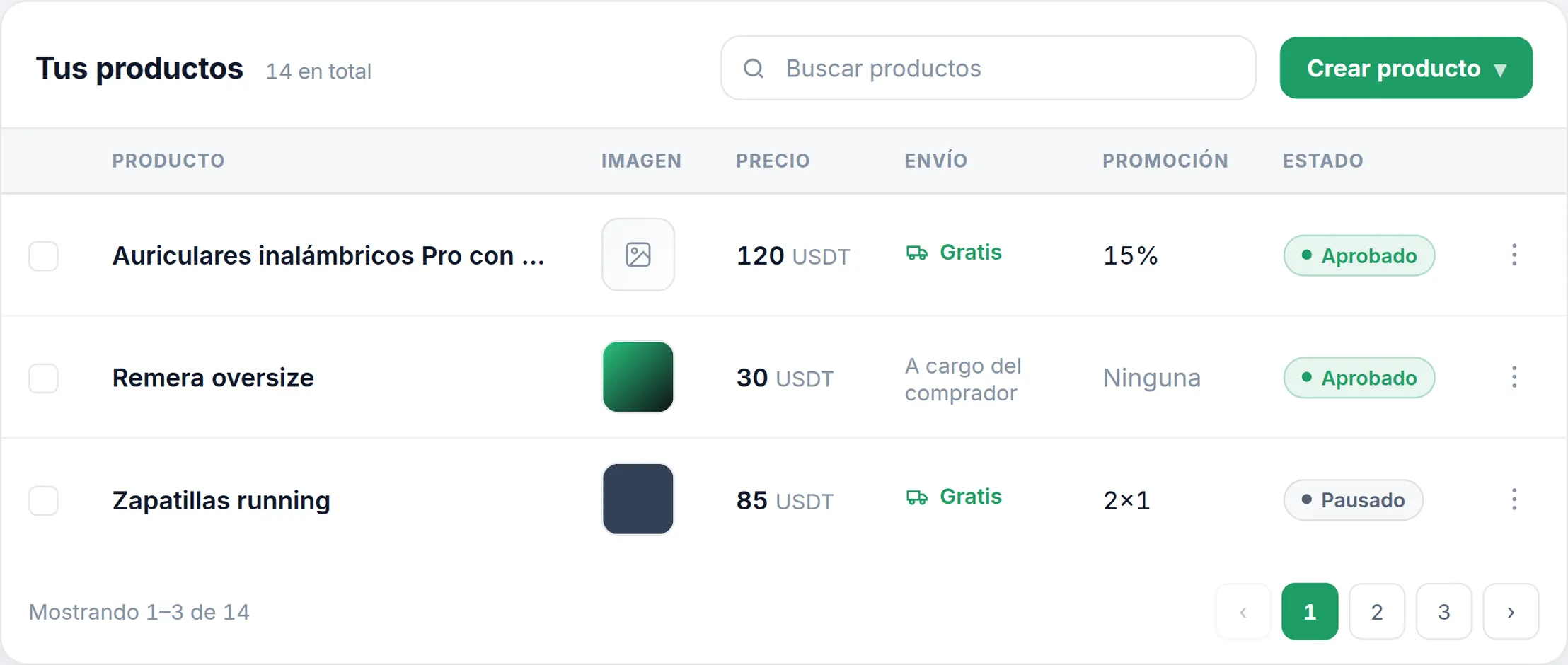
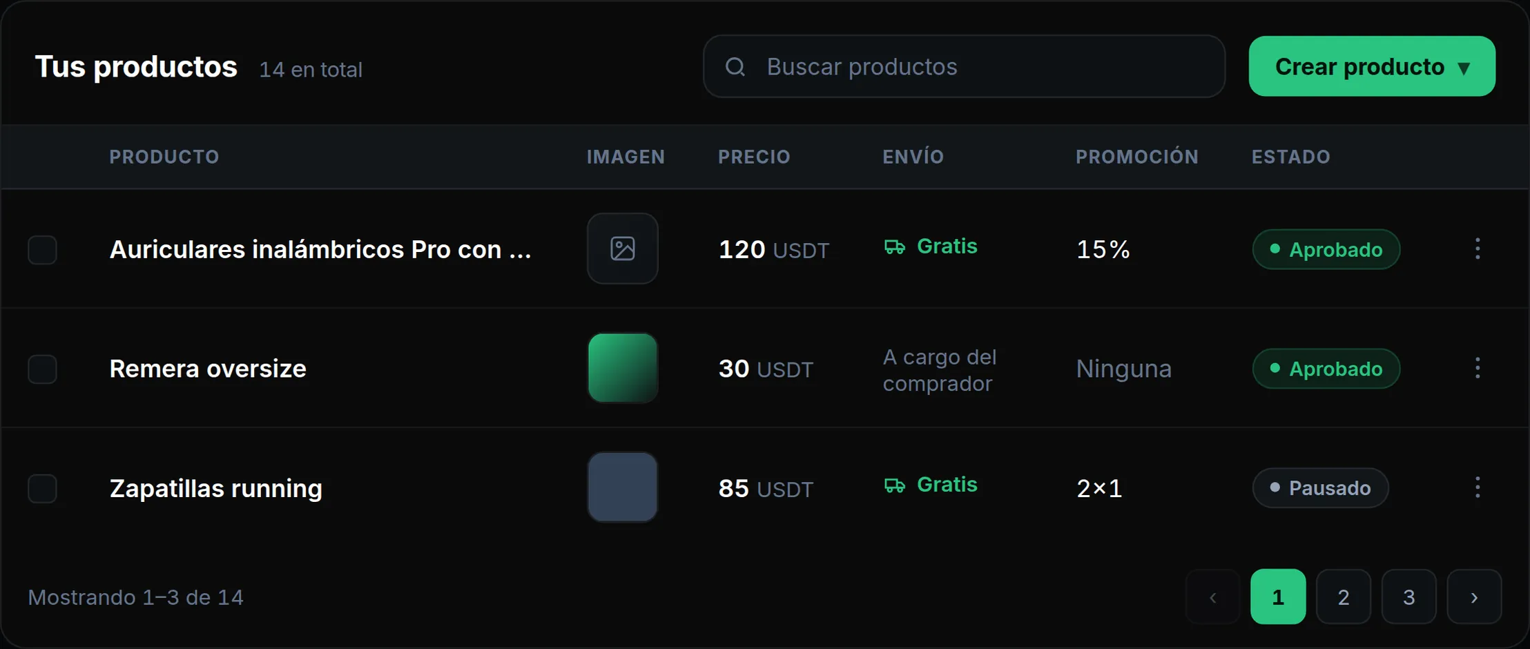
Light and dark, with its own colors.

Liberty had no design system that supported themes. With the dashboard, I gave it its own visual identity that makes them possible, with a light mode by default that conveys order and trust.

The Products table of Liberty's seller dashboard: the left half, in light modeand the right half, in dark mode

How I used AI

First, the validated design. Then, the agents build.

The agents built fast, so I set up checks in layers: automated tests check the code, the browser checks the screen, and the comparison with the prototype checks the design. At the end, I review it myself.

Prototype · sample data

The Metrics prototype of Liberty's seller dashboard, with sample data: out-of-stock products, rating, questions, active products and how much is left to complete the store
Before it ships, each part goes through:
  1. Types, lint and unit tests
  2. The production build
  3. A browser walkthrough in light and dark, at three widths
  4. The comparison with the prototype: type, sizes, colors and spacing
  5. My own review, on the working build, before each release

Result

In production since August 31.

What got celebrated most: everything a seller needs, in one place, organized and instant, and a more premium Liberty. Before, every section change reloaded the whole screen with a 3-second animation.

Liberty seller dashboard, before: the full-screen loading screen, with the logo on black, “No middlemen” and a loading bar
Before · the 3-second wait
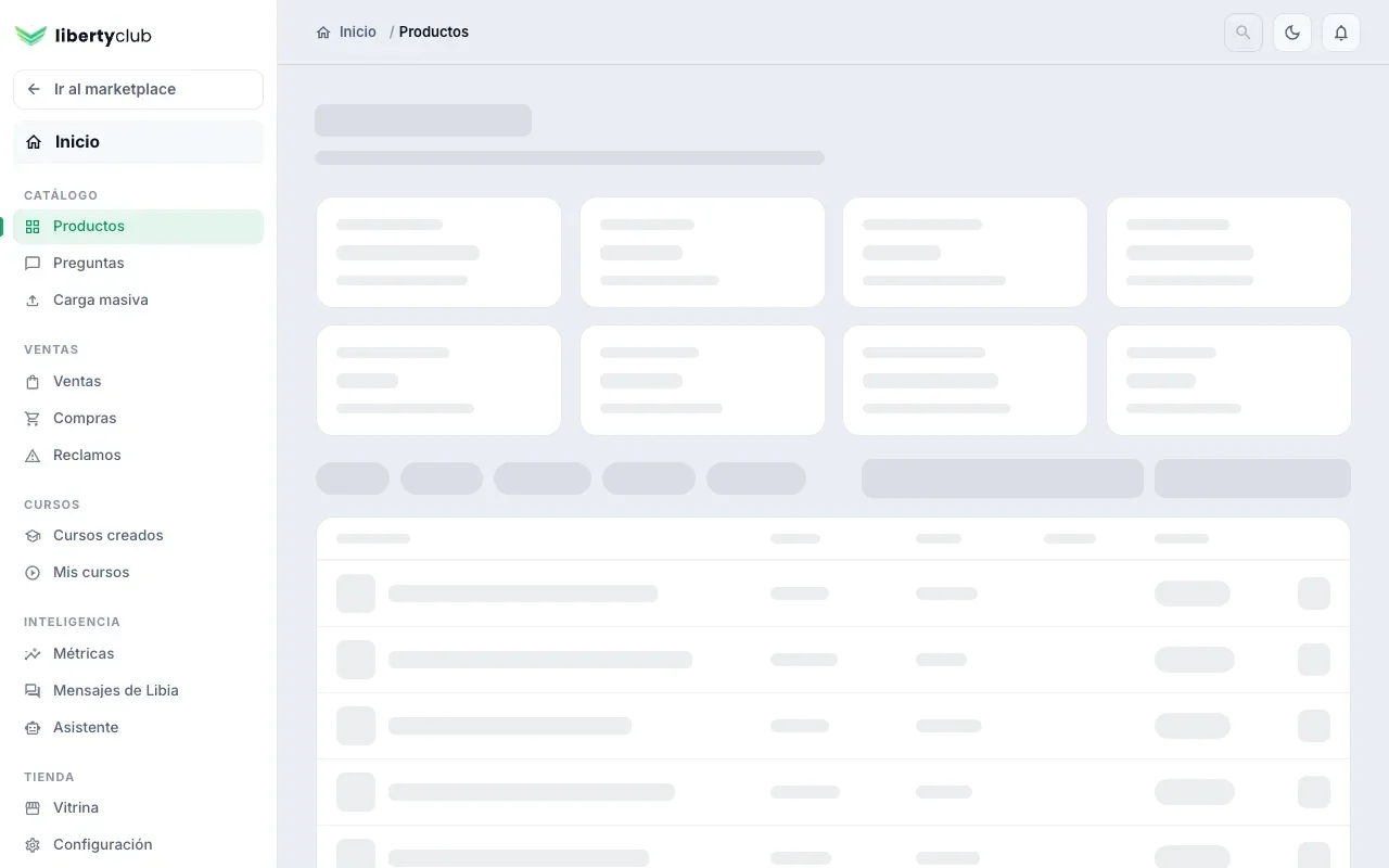
Liberty seller dashboard, now: Products while loading, with the sidebar and the shape of the screen in gray blocks
Now · a loading state that previews what's coming